— ROLE
Story Board
Style Frame Modelling
Animation (2d, 3d)
Sound Design
— SOFTWARE
Adobe After Effects
Cinema4D
Adobe Illustrator
Adobe Audition
— LENGTH
4 months
Project Brief
This project is a promotional tourism ad for Aichi in Japan. Aichi is one of the largest prefectures in Japan and has exciting tourist resources, yet it isn't as popular as other areas of Japan. Through this video, I aim to increase Aichi's publicity and popularity. With the introduction of a new flight route between Japan and Vancouver in the spring of 2024, this was the perfect chance to target the ad at Vancouver residents looking for new travel destinations. Thus, Vancouver’s unique context and pain points were highlighted in this ad, with a flat design style that intrigues viewers and makes them feel closer to Aichi.
この卒業制作としてのプロジェクトは、日本の愛知県をテーマにした観光プロモーション映像です。愛知県は日本でも有数の規模を誇り、魅力的な観光資源も多く存在しますが、他地域に比べて知名度が高くありません。この映像では、愛知県の認知度と人気の向上を目的としています。また2024年春、日本とバンクーバーを結ぶ新しい直行便の就航をきっかけに、バンクーバー在住者に向けて新しい旅行先として愛知県を紹介する絶好の機会と捉えました。そのため、映像内ではバンクーバーの独自の文脈や課題に共感を持たせる構成とし、フラットデザインを用いて、視聴者が愛知県に親近感を持てるよう工夫しました。
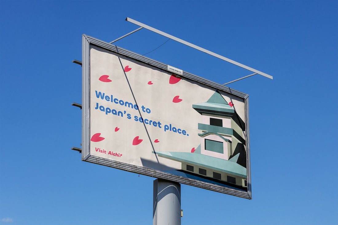
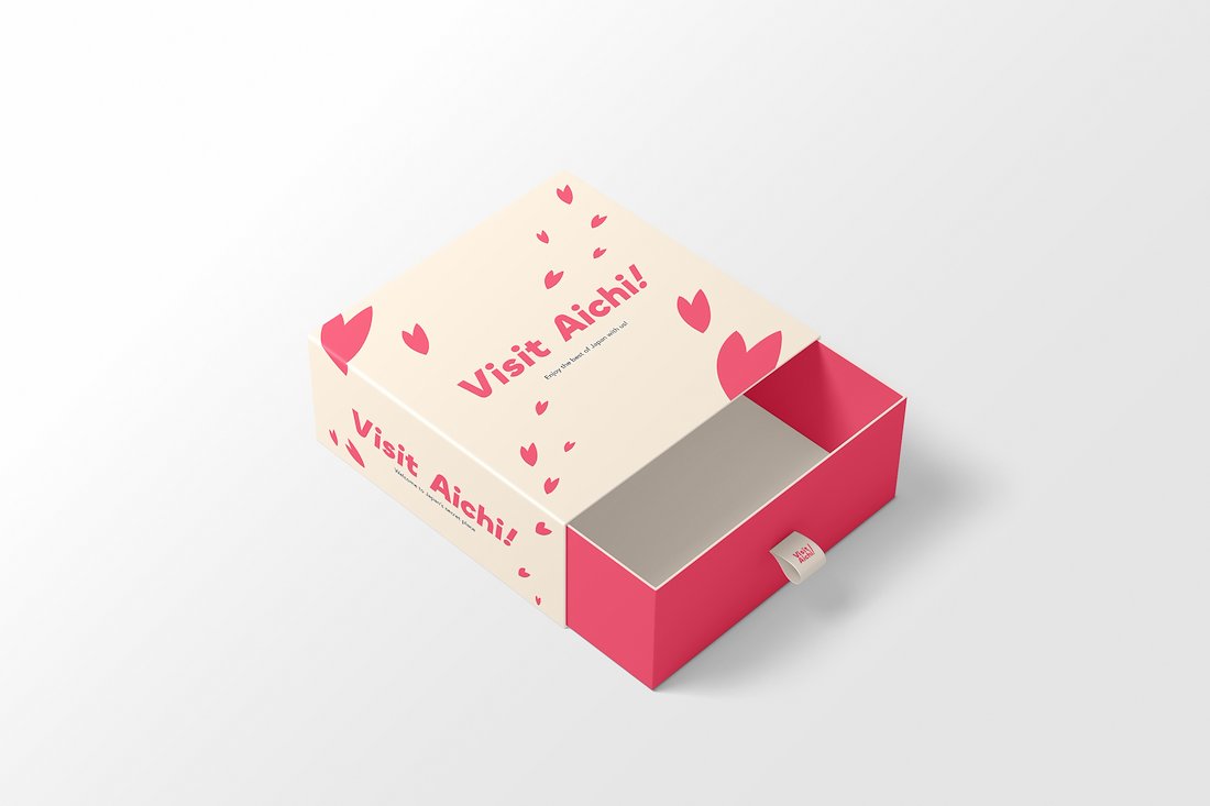
Mockups
Planning
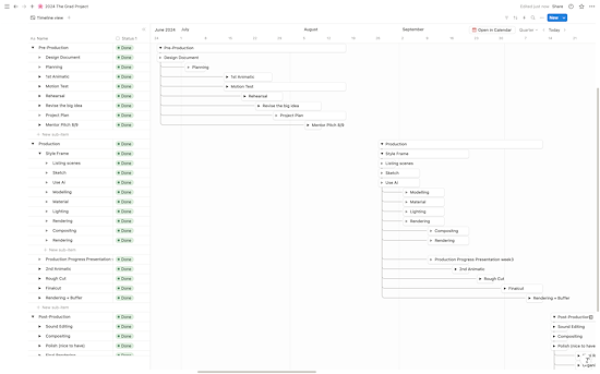
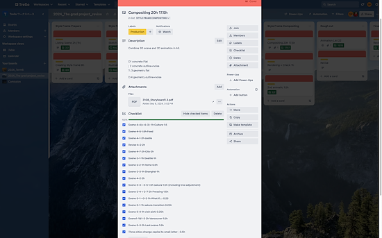
Before initiating this project, I established a structured scheduling system using Notion and Trello to stay organized. Notion provided an overview of the long-term timeline, while Trello enabled efficient tracking of daily tasks.
プロジェクト開始前に、効率的に進行できるよう Notion と Trello を活用したスケジュール管理システムを構築しました。Notion では長期的なタイムラインを俯瞰し、Trello では日々のタスクを効率的に管理できるようにしました。
AWARDS
- It’s Nice That
- AIGA
- Fonts In Use
- The Dieline
CONTACT
youremail@yourname.com
646-987-2345
Research
Before initiating this project, I established a structured scheduling system using Notion and Trello to stay organized. Notion provided an overview of the long-term timeline, while Trello enabled efficient tracking of daily tasks.
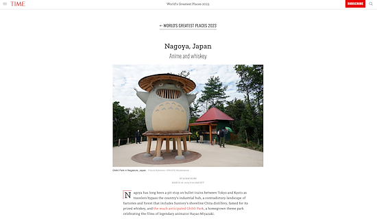
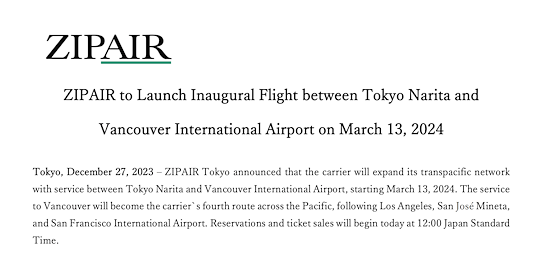
愛知県の観光について調査を進める中で、2つの重要な点を発見しました。1つ目は、愛知県の名古屋市が TIME 誌によって「世界の素晴らしい場所50選」に選ばれたこと。2つ目は、日本の航空会社がバンクーバーと日本を結ぶ新しい直行便を開設していたことです。これらの発見をもとに、ターゲットをバンクーバー在住者に設定し、愛知県の独自の魅力を訴求する方向性を決定しました。
AWARDS
- It’s Nice That
- AIGA
- Fonts In Use
- The Dieline
CONTACT
youremail@yourname.com
646-987-2345
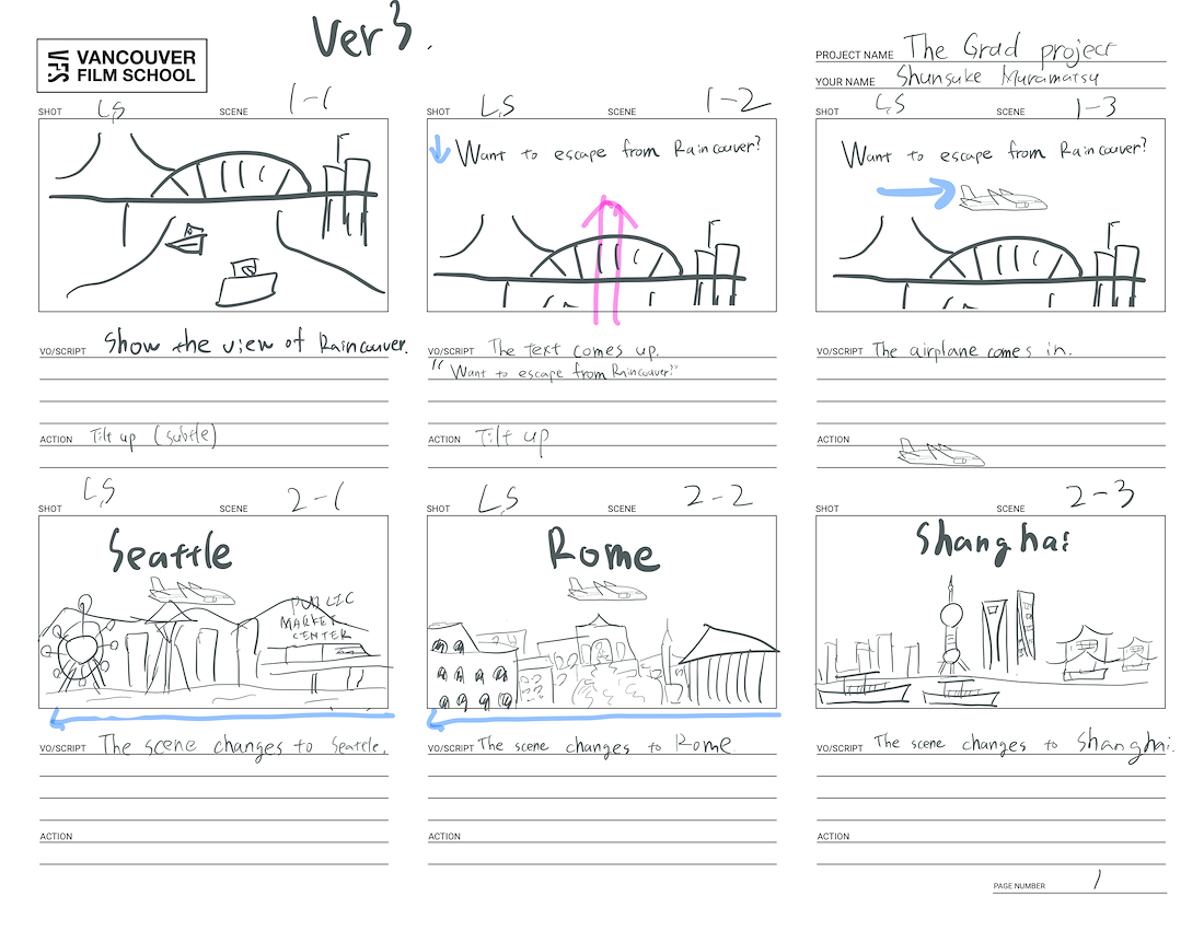
Story Structure
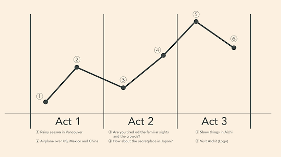
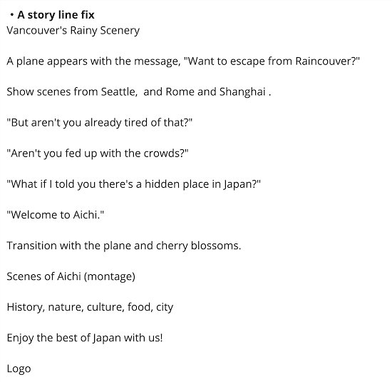
To make this project stand out from existing works, I tailored the narrative to resonate with the target audience by focusing on a specific context: Vancouver’s rainy season, using it as a relatable starting point.
既存の観光映像との差別化を図るため、バンクーバーの雨季という特定の文脈に焦点を当て、ターゲットに共感を呼び起こすストーリー構成にしました。雨の多いバンクーバーの生活を出発点とすることで、視聴者が親しみを持てる導入を意識しています。
AWARDS
- It’s Nice That
- AIGA
- Fonts In Use
- The Dieline
CONTACT
youremail@yourname.com
646-987-2345
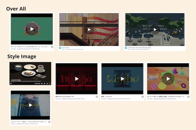
Reference
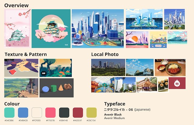
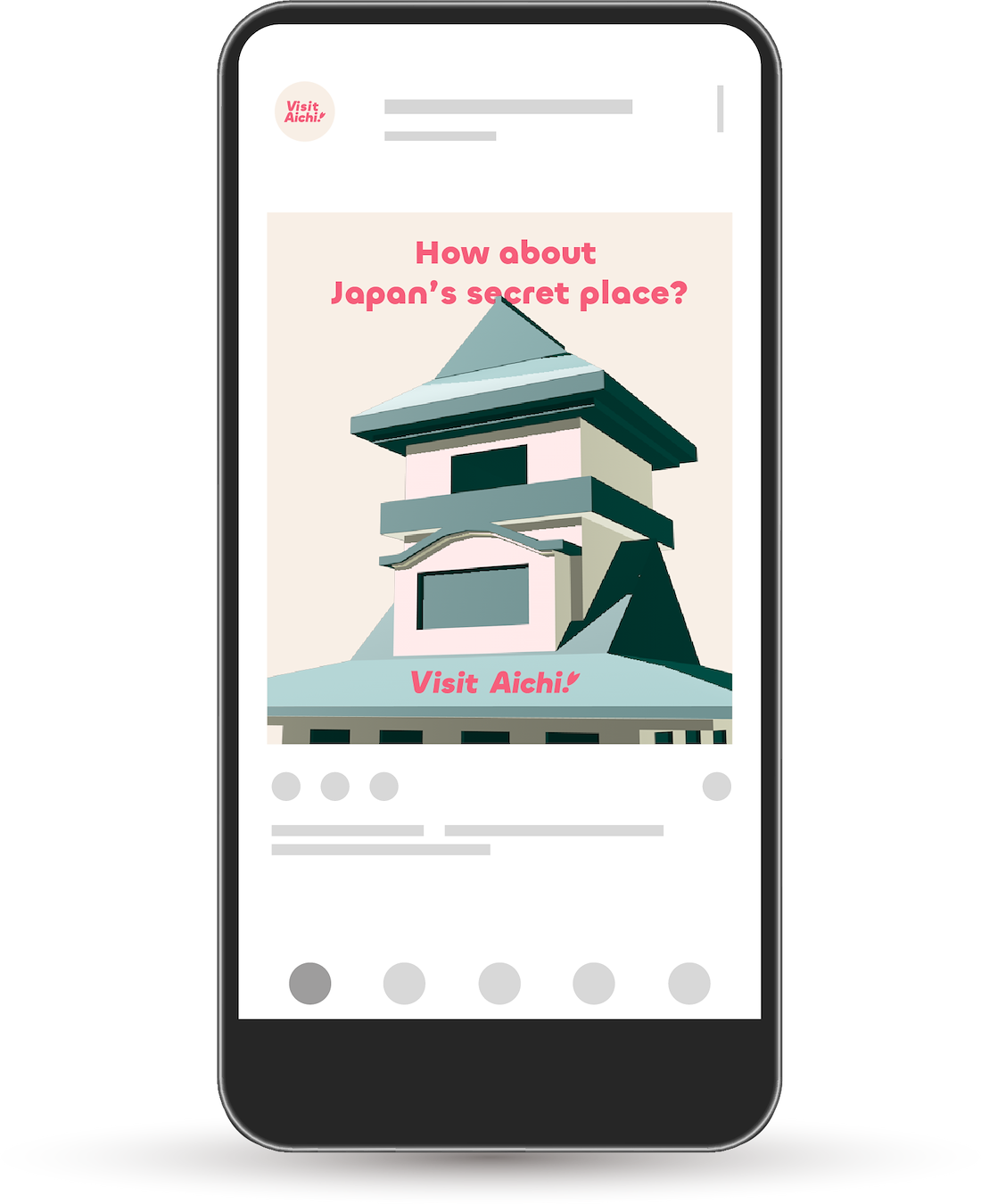
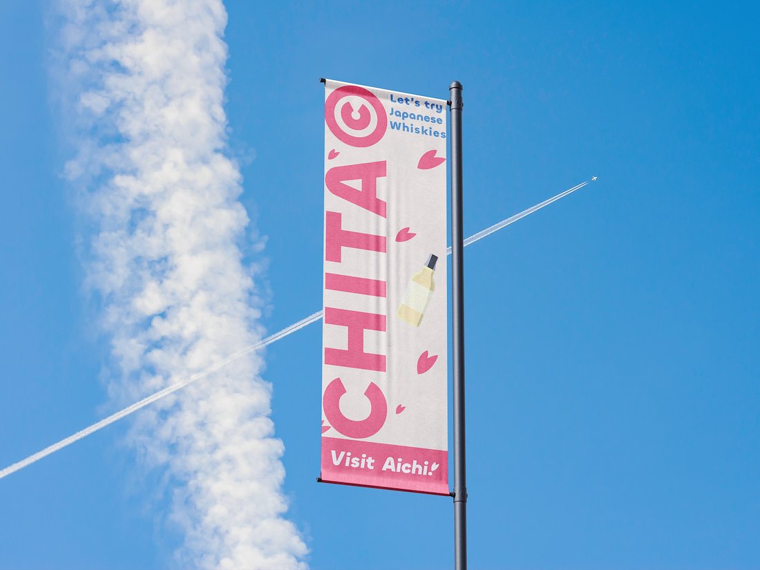
To convey Aichi's vibrancy, I opted for a colourful palette. Softer hues were incorporated to create a warm and approachable feel for the audience. To further distinguish this project, I avoided live-action footage, instead selecting a flat graphic design style that evokes both familiarity and originality.
愛知の活気を伝えるため、カラフルな色使いを採用しました。同時に柔らかいトーンの色を取り入れることで、温かみと親しみやすさを感じられる印象に仕上げています。また、他の観光映像との差別化を図るために実写映像は使用せず、フラットなグラフィックデザインを選択し、親しみやすさと独自性の両立を目指しました。
AWARDS
- It’s Nice That
- AIGA
- Fonts In Use
- The Dieline
CONTACT
youremail@yourname.com
646-987-2345
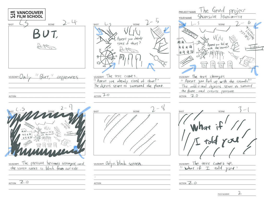
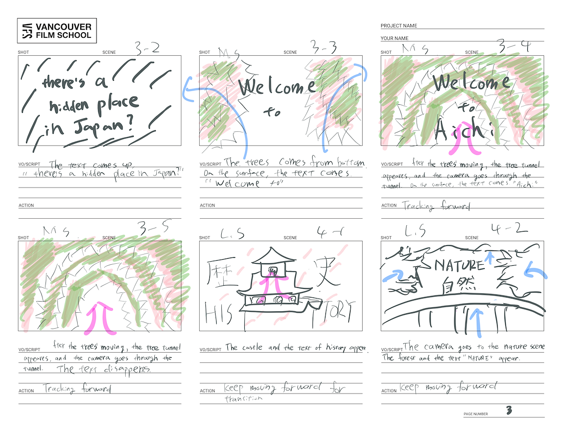
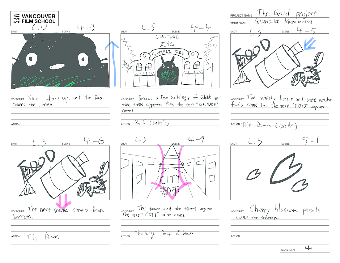
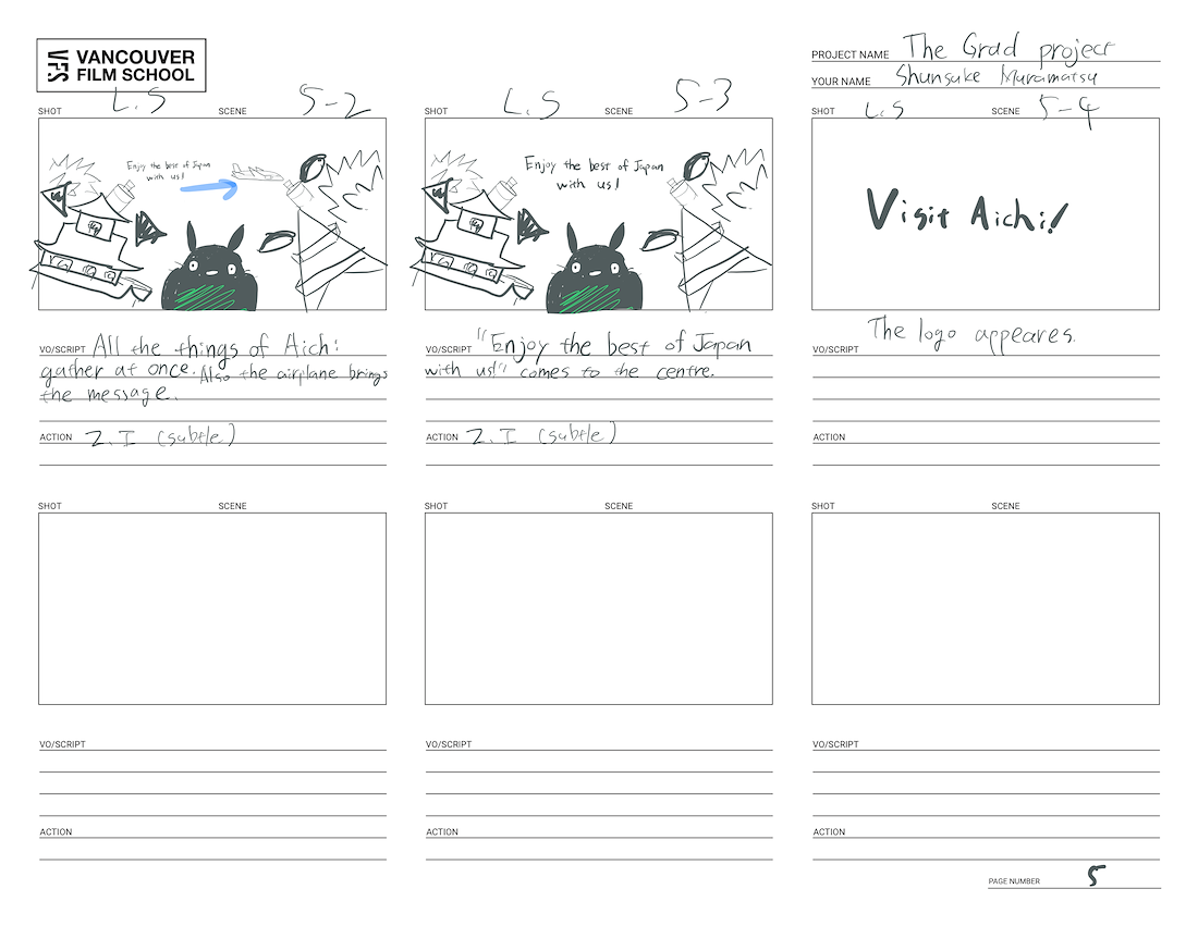
Storyboard and Animatic
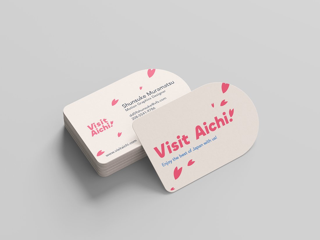
Logo

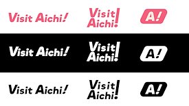
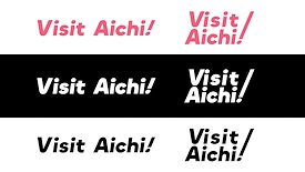
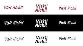
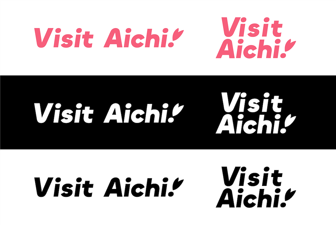
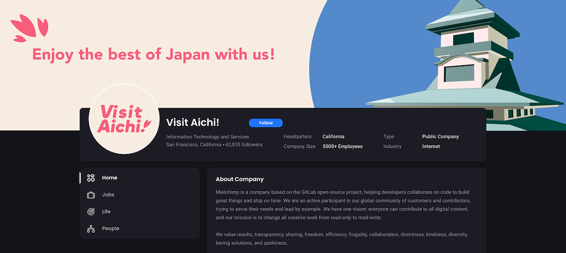
As the call to action in the video, I created a custom logo. After several revisions, I aimed to capture Aichi’s playful spirit through colour and typeface. The colour was inspired by cherry blossom petals, and I chose a rounded typeface to enhance Aichi’s lively vibe. To make the message strong and clear, I titled the project "Visit Aichi!"
映像内のCTAとして、オリジナルのロゴを制作しました。何度かの改訂を経て、色彩と書体を通して愛知の持つ遊び心ある雰囲気を表現することを目指しました。カラーは桜の花びらから着想を得ており、書体には丸みのあるフォントを採用することで、愛知の明るく活気ある印象を強調しています。メッセージをより強く、わかりやすく伝えるため、プロジェクトタイトルを「Visit Aichi!」としました。
AWARDS
- It’s Nice That
- AIGA
- Fonts In Use
- The Dieline
CONTACT
youremail@yourname.com
646-987-2345
Production and Post Production
Challenge
Pre-Revisions
Post-Revisions
One month before the submission deadline, I completed a rough cut and sought feedback to prepare for the Final Cut. A significant amount of feedback pointed out that the quality of the section leading up to the introduction of Aichi was lacking. Through the feedback, I identified the illustrations and compositing as the main causes. However, improving the illustration quality at that stage was not feasible due to time constraints.
As a time-effective solution, I opted to revise the storyboard while reusing the existing illustrations. Additionally, I adjusted the style to align with the new storyboard, transitioning to a cinematic approach. This change emphasized the contrast between the rainy season in Vancouver and the vibrant landscapes of Aichi.
提出期限の1か月前にラフカットを完成させ、最終版に向けてフィードバックを受け取りました。多くのフィードバックで指摘されたのは、愛知県の紹介パートに至るまでの映像のクオリティが不足している点でした。その原因を分析した結果、イラストとコンポジットのクオリティに課題があることがわかりました。しかし、当時のスケジュールではイラストの描き直しは現実的ではありませんでした。
そこで、限られた時間の中で効果的に改善する方法として、既存のイラストを活かしつつストーリーボードを再構成する方針を取りました。さらに、新しいストーリーボードに合わせてスタイルを調整し、映像全体をよりシネマティックなアプローチへと移行。この変更により、バンクーバーの雨季と愛知の鮮やかな風景との対比がより明確に強調されるようになりました。
AWARDS
- It’s Nice That
- AIGA
- Fonts In Use
- The Dieline
CONTACT
youremail@yourname.com
646-987-2345